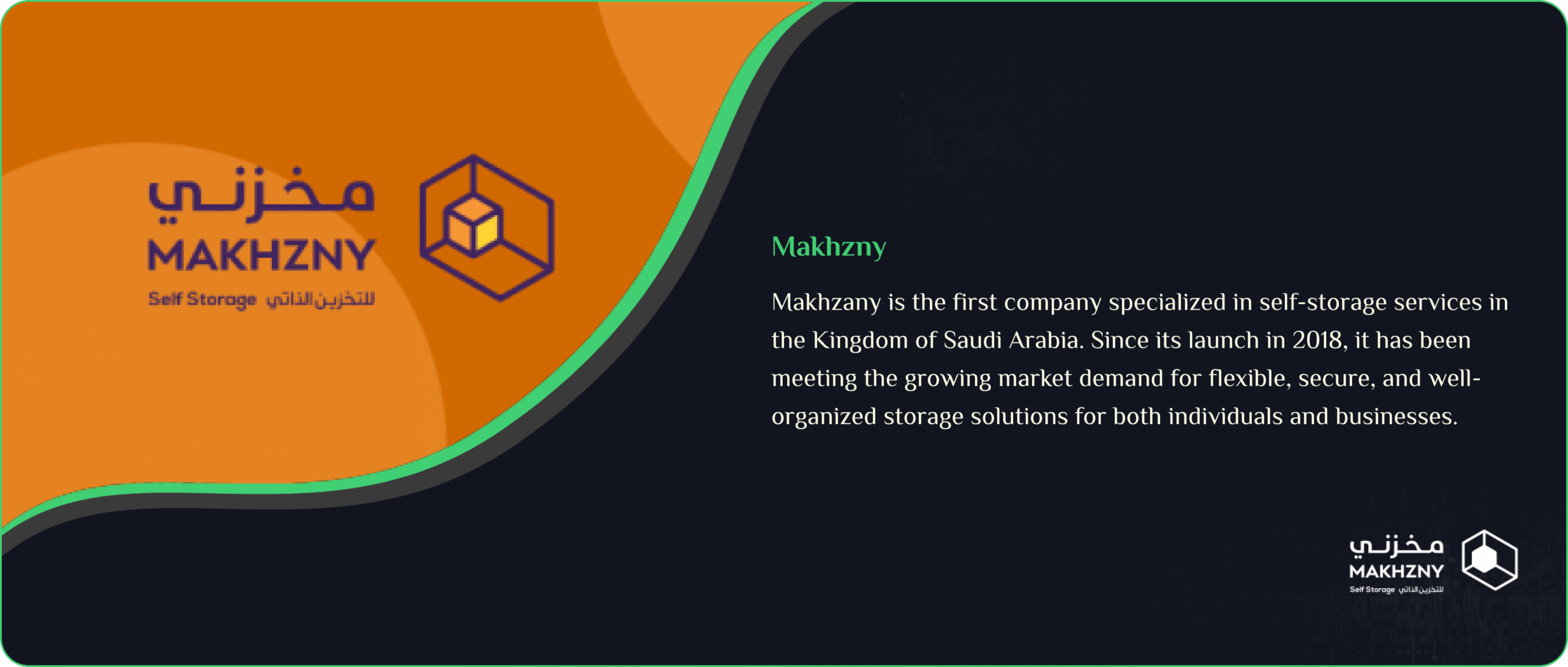
Lack of clear positioning as a market pioneer: Although Makhzny is the first self-storage company in Saudi Arabia, its digital presence did not highlight this leadership in either design or content.
Difficulty in explaining the concept of self-storage to new visitors: As the idea is still relatively new in the local market, it was a challenge to communicate the concept in a simple, clear, and convincing way.
Complex user journey due to multiple services: From storage to offices, meeting rooms, and transportation, the services needed to be structured without confusing or overwhelming users.No clear booking system or direct user journey: Clients had to contact the support team manually for booking, which increased workload and slowed decision-making for potential customers.
Poor mobile performance: The previous design wasn’t fully responsive, which negatively impacted the large number of customers browsing from mobile devices.
Outdated visual appeal: The images, colors, and presentation style felt traditional and didn’t reflect the modern nature of the services or the target audience
Solutions Implemented
Highlighting market leadership in self-storage: We designed a digital identity that emphasizes Makhzny as the pioneer of self-storage in Saudi Arabia, with clear differentiation points on the homepage.
Simplified, visual explanation of the service: We used infographics, short videos, and concise points to explain how self-storage works and its benefits for individuals and businesses.
Organized services into clear, interconnected sections: Dedicated pages were created for each service (Storage – Offices – Meeting Rooms – Transportation), showing benefits, pricing, and booking steps.
Developed an easy and fast online booking system: Direct booking forms were added to each service, allowing customers to select location, unit type, and booking time — reducing reliance on manual support.
Fully responsive design: A mobile-first approach ensured seamless browsing across smartphones, tablets, and desktops.Enhanced visuals and marketing content: We introduced modern colors, realistic imagery showing facilities and spaces, and a clear marketing tone focused on solutions rather than technical details
Visual and typograpy hierarchy
We implemented a clear visual and typography hierarchy to enhance readability and highlight key academic messages. By using consistent colors, font sizes, and structured layouts, we ensured that the university’s identity is reflected with both professionalism and clarity
This Is Text Message
Medium Typography
Just Amazing
Awesome
SolNex thrives on a passion for clean and innovative technology, moving forward with confidence as a rising tech company with a future-driven vision. Discover our latest innovations on @SolNex and explore inspiring highlights of who we are .
We’re a team of creatives passionate about transforming ideas into powerful digital experiences — from standout branding to top-notch UI/UX for websites and apps.