1. Identity
Luxury Egyptian watch retailer since 2014
2.Commitment
12 branches delivering premium customer service
3.Foundation
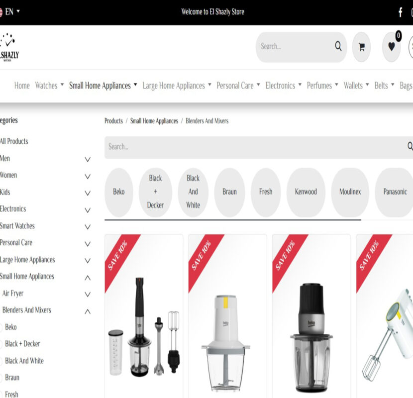
Elegant designs, clear structure, and advanced filtering
4.Vision
Fully responsive, fast, and optimized shopping journey
Challenges We Faced
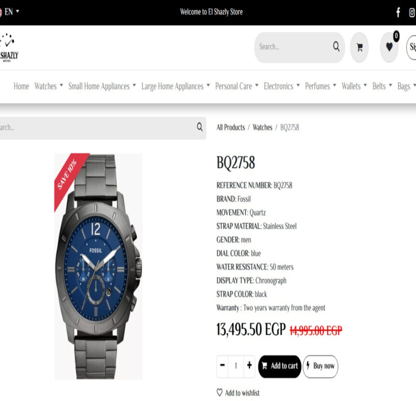
- Highlighting watches as the main product category:
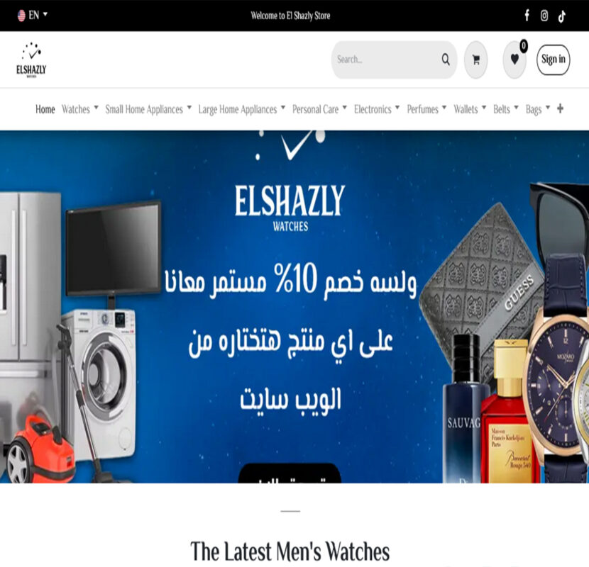
Dedicated prominent visual sections for watches on the homepage and inner pages, including a “Best Sellers” section. - Luxurious yet clear interface design:
Implemented elegant colors, clean typography, and balanced white space to reflect product quality and build user trust. - Reorganized product categories and structure:
Rebuilt navigation with smart classification, offering dedicated pages for each brand and type. - Advanced filtering system:
Added filters for brand, category, price, color, and strap type to simplify search and decision-making. - Fully responsive design:
Optimized the interface for smooth browsing across mobile, tablet, and desktop, significantly enhancing mobile shopping. - Performance and speed optimization:
Compressed images, implemented CDN and lazy loading to deliver a faster, smoother user experience
Solutions Implemented
- Academic and professional user interface design:
We used academic-oriented colors, typography, and layouts to create a simple yet prestigious visual identity. - Clear information architecture:
The website was organized into main and sub-sections, supported by an intelligent search system for quick access to programs and information.Digitization of curricula with flexible formats:
All curricula were converted into digital files (PDFs, presentations, interactive links) and uploaded by faculty and program category, with access secured by user permissions. - Visual representation of institutional values:
We implemented icons, infographics, and concise highlights to communicate the university’s values clearly and effectively. - Fully responsive design:
The website offers smooth navigation across all devices while maintaining fast and lightweight performance. - Integration of academic programs with digital content:
Each program is directly connected to its digital curriculum, making it easier for students and faculty to access courses straight from the program’s page
Visual and typograpy hierarchy
We implemented a clear visual and typography hierarchy to enhance readability and highlight key academic messages. By using consistent colors, font sizes, and structured layouts, we ensured that the university’s identity is reflected with both professionalism and clarity
This Is Text Message
Medium Typography

Just Amazing
Awesome
SolNex thrives on a passion for clean and innovative technology, moving forward with confidence as a rising tech company with a future-driven vision. Discover our latest innovations on @SolNex and explore inspiring highlights of who we are .
Our Vision Creative Web Agency


